Skoolie Design | Community | Course
Mobile App
How Might We….
Establish a smooth and tension-less A to B experience for building a skoolie(RV Converted School Bus) from the frame up?
Overview
Recently, my wife and I have forgoed a daunting but satisfying task of converting a school bus into full time living space for our family that can reliably travel across the country.
Though we did get the project finished, it took much longer than anticipated mostly because we didn't have a clear path or any idea of how to do the conversion. This is where my inspiration for this mobile application came into fruition.
Problem: Bus conversions are a daunting task with a large learning curve and there’s no other company that focused solely on skoolie design.
Solution: Provide an intuitive mobile app that can allow our users to access a community for inspiration and questions, step-by-step building guides, and most importantly the design tool.
My Roles:
1. User and market research
2. Design and ideate
3. Branding and style guide creation
4. High fidelity mock-ups and prototyping
Research
Examples of Skoolies
Primary: I felt relieved and more confident in the project after conducting interviews and also performing user testing to gather data which supported my personal experience with the converting process.
Secondary: Diligently researched online different pain points of the bus conversion and performed competitor analysis to see if there were any apps that were similar and found out what quirks they had.
Our Users
Affinity Maps
I found these concepts to be most important and stuck out the most. There are more concepts in the other research but wanted to focus solely on the interviews first before diving deeper in concepts. It is difficult not to be biased when creating an affinity map especially when it's not done in a team setting. But using the codes and keywords that stuck out from the interviews helped me look outside the box.
Design and Ideate
Information Architecture
To start forming an idea of the user flow I felt that these sitemap methods were necessary and priority before jumping into…
….The user flow red routes
Hand-Sketched onto paper first to get the user flow steps visualized. Then I created the digital sketches using Miro and some phone templates after feedback from guerilla testing the hand sketches.
Don’t worry! Desktop versions were also accounted for.
Branding and Style Guide Creation
To briefly give some context on the branding, I actually created Everywhere to Anywhere originally to be an eCommerce business to sell products for skoolie conversions. After some trial and error and also more research, the E.T.A. brand needed a different route.
So why not build an app that sits perfectly aligned with the branding that already exists and already has a presence within the Skoolie community?
High Fidelity Wireframes and Prototyping
For the final and most exciting part of the project! This is where you start seeing the app come to life.
Started with the wireframes…
Added elements and color palettes from the style guide plus a UI kit and imagery and now we have a high fidelity mockup.
Prototype and user testing
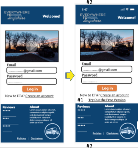
The mockups that you see above didn’t originally look or flow this way. Before getting to this point I held two sessions of user testing to get a better idea of what can be improved on the design.
Phase One of Usability Testing
Common issues:
#1 Finding the free version from the start up screen.
#2 Needs to feel more like the phone that its design is based off of. Elements are blocked by phone hardware.
#3 Navigating issues with going back to home or other menus and pages.
Phase Two
Here is a link for the iterative test report: https://docs.google.com/document/d/1csluK-qDwcg1YpJXLnglhIjSs5kwz_nvEEfUasd3B8k/edit?usp=sharing
Common issues:
#1 The Dot Icon that minimizes the Bus information pop up when you start designing isn’t clear and is in a random spot.
#2 Rotate icon isn’t needed in a real world app.
#3 Address icon alignment and icon/text priority.
With the given feedback from the two phases of testing I was able to fix some UX issues that I didn’t catch initially. Overall, the final prototype was greatly enhanced from the original wire-frames and look forward to bringing the prototype to the actual mobile app market.
Design and Ideation tools used for the project: Miro and Figma
Interactive prototype link:
Reflection and Future Plans
A converted bus project and a mobile app project like this can be both a daunting and time consuming endeavor. But both projects alike can be broken down into steps and be tackled one section or phase at a time. Not only did the processes mentioned in this case study help me learn concepts of UX/UI Design but also understanding my direction for the Everywhere to Anywhere brand and what I want to do to monetize the skoolie conversion market.
The next steps and future for the Everywhere to Anywhere App is to further test and design for a community section and then start compiling solid content for the different pages. Once all sections of the app are accounted for we will be working with a mobile app developer to get an actual app in the works. The ultimate goal is to get the app launched by summer of 2024!


